Table of contents
Related articles
- Basic Configuration - Service Requests
- Identify incident templates and SR types as visible on Web Portal
- Custom Field Library
- Value Lists
- Alternate Subject and Subject Destination
- Advanced Task Configuration
Introduction
The Octopus form is a powerful and user friendly tool when its configuration is kept up to date and has been well planned. It provides a way to enter data quickly and in a standardized way, whether the input is done by an end user on the Portal or an Octopus user in the application.
In addition, it allows to build workflows with tasks, exploit the information captured in the forms and support business rules.
In this Wiki, we will cover the basic use of forms, but consult the Wikis related to this one to find out the best ways of exploiting Octopus forms.
Prerequisites
Incident template and service request types must be created first. For more information see the articles bellow:
Form Visibility
Forms can be visible to the following people:
- Octopus users
- For a form that can only be filled internally. This speeds up data entry and ensures that all the required information is captured.
- As soon as a form is created, it is available to Octopus users.
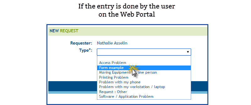
- Users
- Allows users to fill requests on their own from the Web Portal.
- Will be available on the Portal if the option Visible on the Web Portal is checked
Form Restriction
It is possible to filter who can make a specific request type. The option can restrain in two ways:
- By user group.
- By site.
- For more information see the Specific cases of requests restricted by site article.
The restriction is based on the person who makes the request, it works on requests that are opened from the Web Portal or internally. If the requester is not allowed to submit or ask for a request type, it will simply not come up on the list of available requests. To find out more on request restrictions, see the Restrict a template Wiki.
Requests are restricted on the Web Portal as well as in the Octopus application.
In order for an Octopus user to be able to select a restricted request type, he must first enter the name of a requestor associated with a group or site that is allowed for this request type.
Available Field Types
The information collected at the creation of a request is important, proper information will allow effective processing of the request. The role of a form is to make it simple for the person filling it out to capture the information. Multiple types of fields help to facilitate the collection of this information. Each type has a different way to gather information, in many cases, as with the CI type, a link is made to the request.
Here is the list of available field types:
|
|
|
The following table shows in detail the result of each type, its description and how it works.
|
Header
|
|
Text
|
|
Large text
|
|
Date
|
|
Date and Time
|
|
Check box
|
|
Combo box
|
|
Radio buttons
|
|
File Attachment
|
|
Comment
|
|
CI
|
|
Site
|
|
Department
|
|
Multi-Users
|
|
Reservation
|
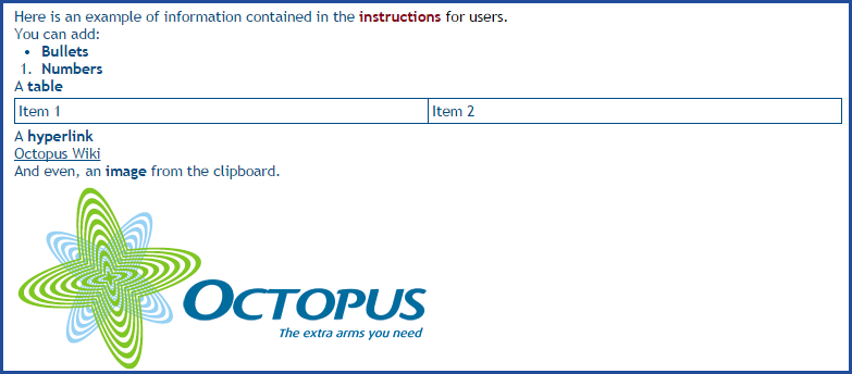
Instructions Section
The instructions section allows to give information or instructions to the user filling out the form.
The instructions appears at the top of the page and this option is configurable per form.

Form Configuration
The permission to Administer Octopus is required to be able to configure forms.
Here is how to proceed to create or modify an incident or SR type form:
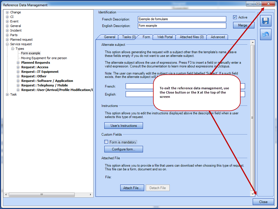
- Go to Tools > Reference data management.
|
A ) For Incidents:
|
B ) For Service requests:
|
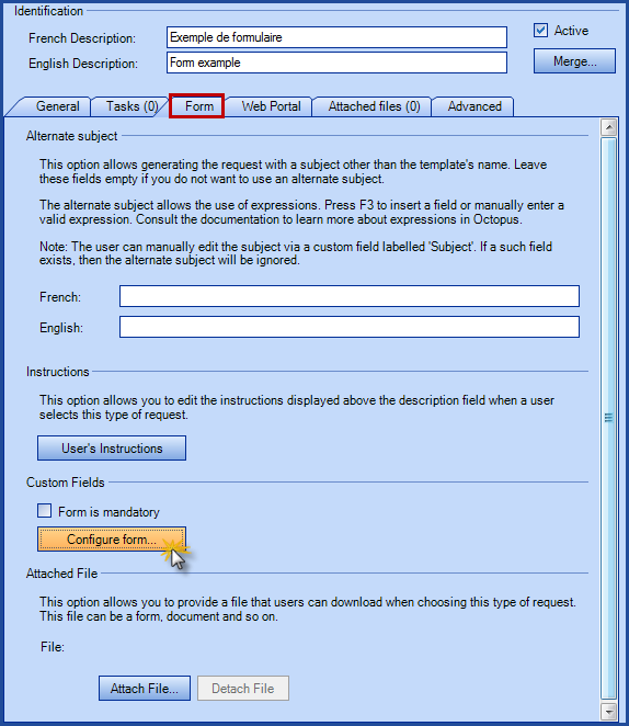
- Access the Form tab.
- Click the Configure form tab.
- A configuration window will open.
- Add or modify the fields in the form.
- Use the OK button in the fields to validate the configuration per field.
- Use the preview to see how the form looks like in English and/or the second language.
- Once the configuration of the form is done, click OK.
- Proceed with the creation/modification of the other forms if required.
- When you are done, use the Close button at the bottom right or the X button at the top right to exit the reference data.
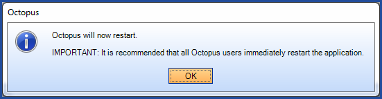
- If modifications were done on the forms, a message will come up on screen advising that Octopus will restart.
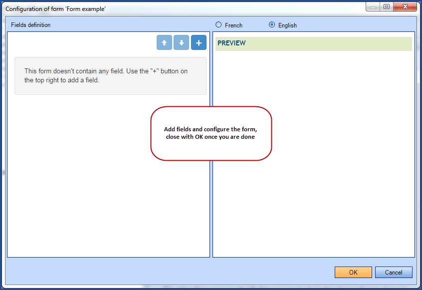
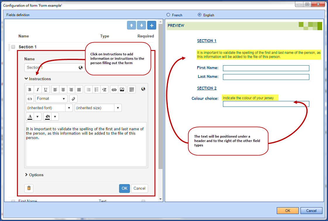
Description and Adjustment of the Form Configuration Window
- The window is separated in two sections:
- On the left; the field configuration section.
- On the right; the live preview section.
- The width of the two sections can be adjusted:
-
Place the mouse on the center line.
-
The window can be adjusted when the mouse takes the form of a black double sided arrow with a line in the middle.

-
Left Section of the Screen
The left side of the screen is the configuration section and it is divided in 3 sections.
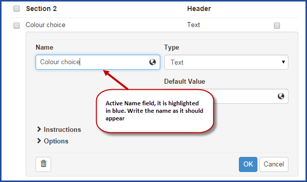
- The field Name.
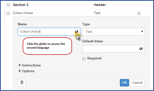
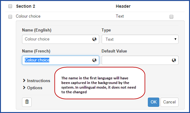
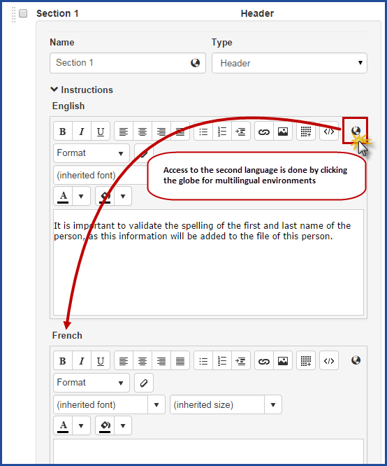
- Since many work environments are unilingual, only one name field is visible. However the system still has two default languages, so this name is automatically copied in the other language without intervention.
- To see the second language, click the icon that looks like a globe.

- The field Type.
- The type selected will determine the available options for configuration.
- If the field will be Required in the form.
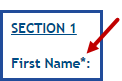
- If this field is checked, a star is visible at the end of the field in the preview section to indicate that is is mandatory.
- If this field is checked, a star is visible at the end of the field in the preview section to indicate that is is mandatory.
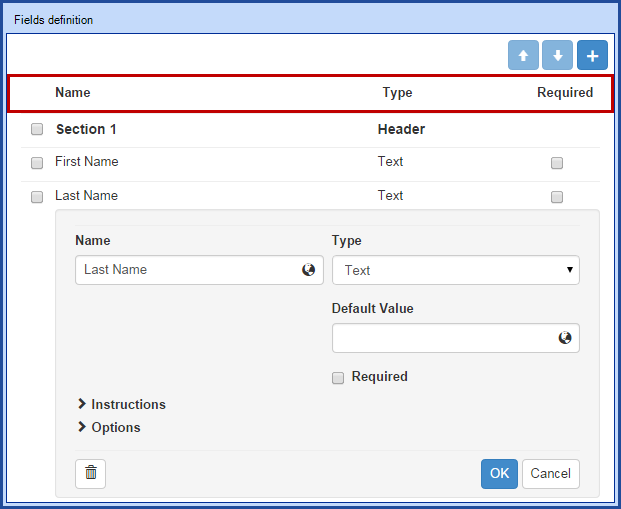
Right Section
The right section of the screen is the live preview mode of the form.
- Additions, modifications and removals can be validated as work is getting done in the form.
- It shows the fields from the form as well as the instructions that have been configured.
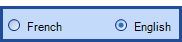
- The preview language can be changed with the radio buttons at the top of the screen.
Add and Move Fields
- Use the button at the top of the right section of the configuration window to add a field to the form.
- By default, a text field will be added.
- The new field will be added at the end.
- To add a new field in a specific place in the form, check the box in front of the field before the one being added and then use the add button. The new field will be added just after the one that was checked.

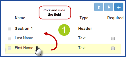
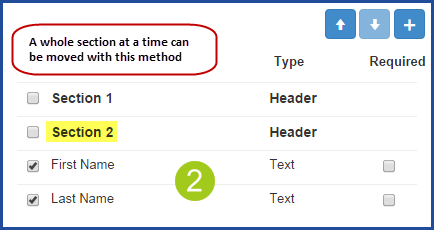
Fields can easily be moved in the configuration section.
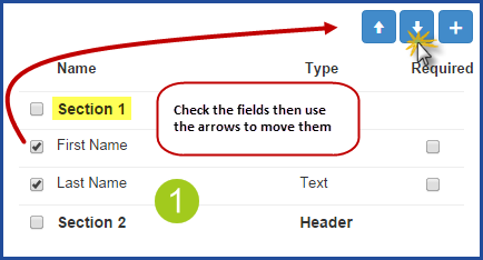
- To move just one field:
- Click and hold the mouse down.
- Slide the field where it needs to go and release the mouse.
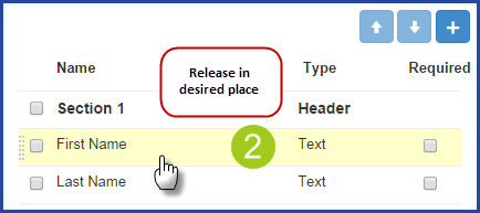
- To move multiple fields at once:
- Place a check on the front of the fields to be moved.
- Use the up and down arrows to move them where they need to go


Moving one field
Moving multiple fields
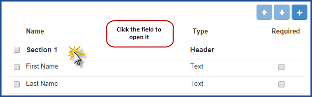
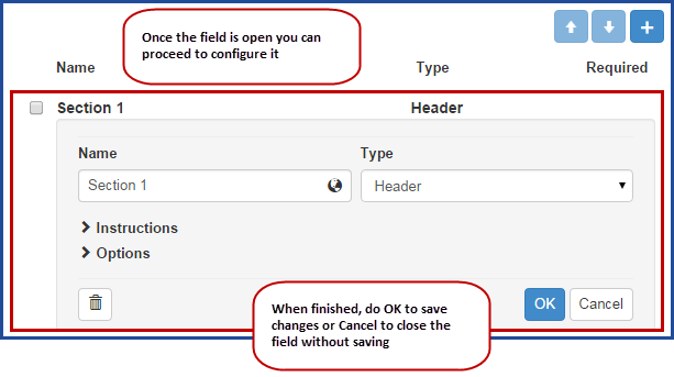
To See or Modify the Configuration of a Field
By default the form presents the list with only the columns Name, Type and Required. To access the configuration of the field you must open it.
- To open the field for configuration:
- Click on the line of the field in the form.
- To save or close the configuration of a field:
- Click on the line of an open field.
- Click on OK to save and close the field.
- Click on Cancel to close without saving.
List of closed fields
With a field open in configuration mode.
Add the Name of a Field
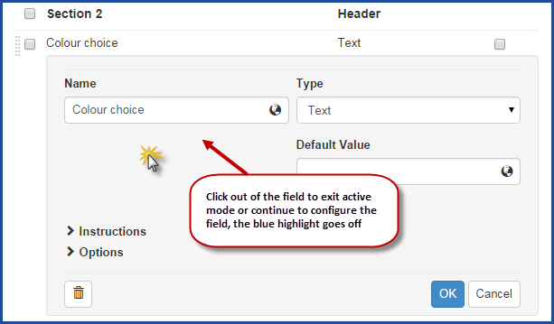
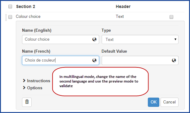
By default, Octopus is based on a multilingual mode, general English and French. The system automatically copies the name of the second language, to prevent environments that are unilingual to have to do this copy. The only thing that is required is to enter the name and then click outside of the field to enable the automated copy. To see the second language, click the globe at the end of the field.
In unilingual mode:
- Write the name of the field as it should appear to the user.
- Click out of the field or continue to edit the rest of the information.
In multilingual mode:
-
Write the name of the field as it should appear to the user.
- Click on the globe at the end of the field.
- Write the name of the field as it should appear in the second language.
- Continue entering the rest of the information.
Choose the Field Type
To facilitate the capture of information, the form offers several types of fields. Use the drop down arrow of the combo box to choose the Type. See the table from the Available field types section to see the result of each field type.
The Instructions and Options fields will be explained a little further. Here are the options or features for each type:
Header
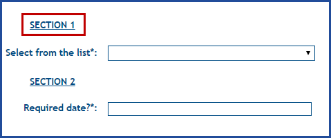
This type allows to separate the form into sections to make it easy to read and understand.
- The field appears in bold in the definition window of the fields to make is easy to locate.
- Since this field cannot be filled, it does not have a Required box available.
Text
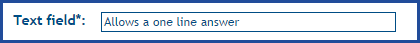
Allows the user to give a free text response on one line.
- Indicate the name of the field as it must appear to the user.
- Add the name in the second language if required.
- A Default Value can be entered if required.
- For a text field, this value is in free text.
- Check the Required box if needed.
- A small star will appear in the form to indicate to the user that the field must be filled.
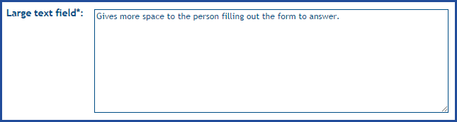
Large Text
Allows the user to give a free text response on multiple lines.
- Indicate the name of the field as it must appear to the user.
- Add the name in the second language if required.
- A Default Value can be entered if required.
- For a text field, this value is in free text.
- Check the Required box if needed.
- A small star will appear in the form to indicate to the user that the field must be filled.
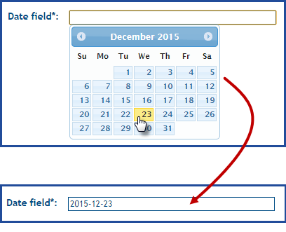
Date
Allows for the user to choose the date from a calendar on the screen.
- Indicate the name of the field as it must appear to the user.
- Add the name in the second language if required.
- Check the Required box if needed.
- A small star will appear in the form to indicate to the user that the field must be filled.
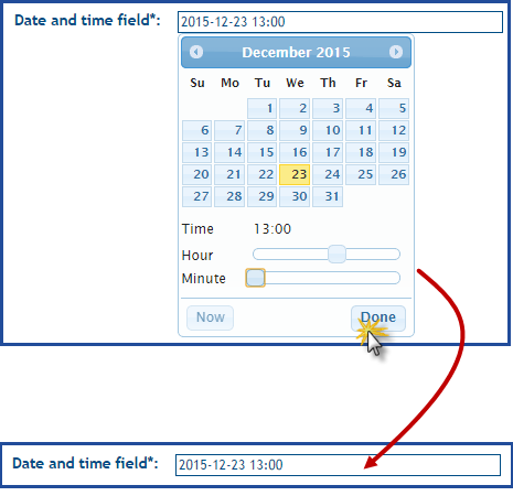
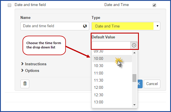
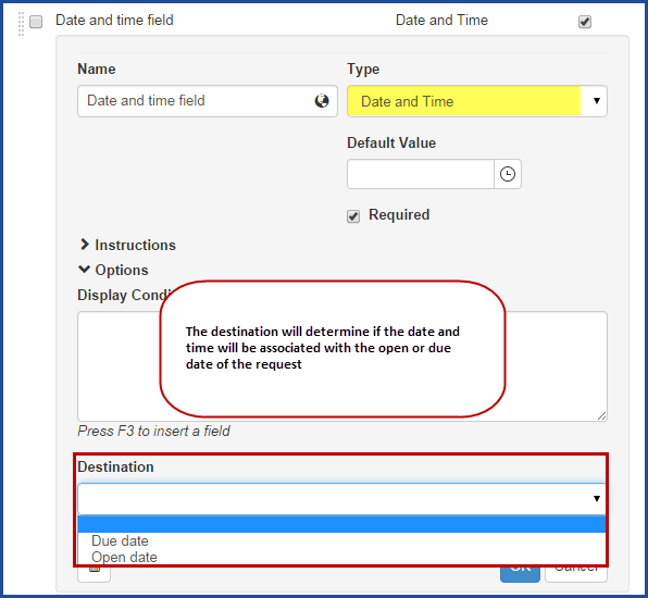
Date and Time
Allows to the user to choose the date from a calendar on the screen and to specify a time too. If the user does not select the time, the system will use the time when the data entry was done, unless there is a default time configured. This type of fields can be used in specific types since the date and time entered can be pushed to the Creation Date or Due Date of the request.
For example, if you want to calculate the exact downtime of an equipment, you can ask the user to determine the moment of the beginning of the outage and send this information to the Creation Date of the request. Another case can have a request for an event or a specific moment and send this date and time to the Due Date field. See the Using the Options section to find out how to configure this option.
Using the Destination field can have an impact on the SLA (service level agreement) of the request if this option is activated.
- Indicate the name of the field as it must appear to the user.
- Add the name in the second language if required.
- A Default Value representing the time can be entered if required.
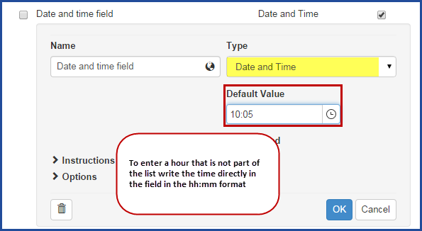
- A drop down list allows to choose the time between 00:00 and 23:30, with a 30 minute incrementation.
- The time can be manually added in a 00:00 format, 10:05 for example.
- Check the Required box if needed.
- A small star will appear in the form to indicate to the user that the field must be filled.
- Choose a Destination from the Options if required.
- This option is not required.
See the Using the Options section to find out how to configure this option.
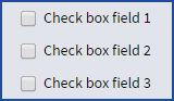
Check Box
- Indicate the name of the field as it must appear to the user.
- Add the name in the second language if required.
- The Default Value is No, choose Yes to check the box in the form.
- As the field indicates the choice of the user, there is no Required field available.
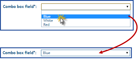
Combo Box
Allows the user to give the answer from a list of specific choices, we recommend using this type for lists that have 5 choices or more. This type of field is helpful to standardize the possible answers from the user, for example, if you want to allow him to choose and equipment from the list of the business standard ones. Or to present a list of symptoms to users in a incidents.
The choices are based on a source to present to the user. See the Value Lists Wiki for more information on the source.
- Indicate the name of the field as it must appear to the user.
- Add the name in the second language if required.
- Choose or create the Source of choices to be presented to the user with the arrow at the end of the field.
- It is possible to see the elements of the list with the ... button or to create a new one with the + button.


- It is possible to see the elements of the list with the ... button or to create a new one with the + button.
- A Default Value can be entered if required.
- One of the elements from the source can be selected.
- Check the Required box if needed.
- A small star will appear in the form to indicate to the user that the field must be filled.
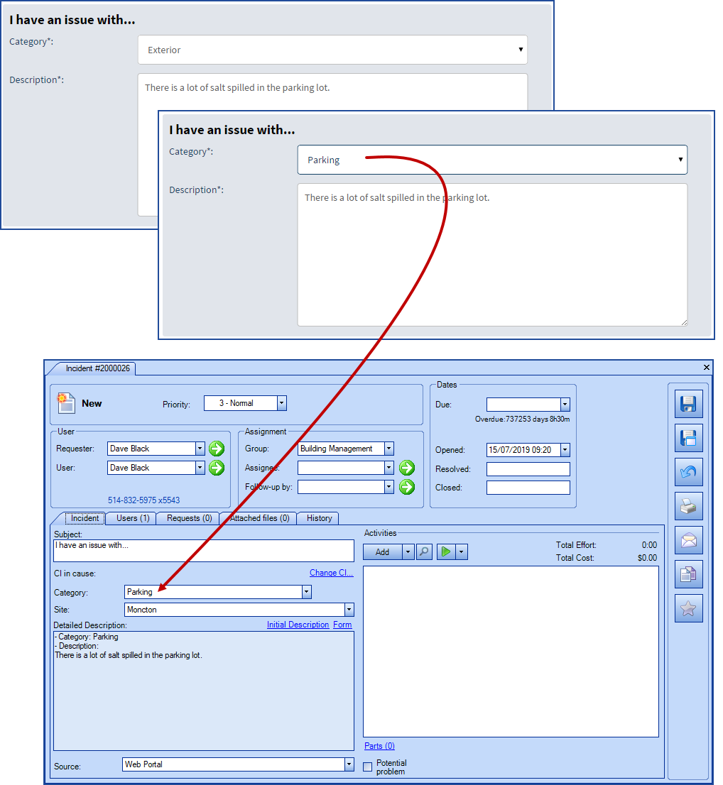
- In the incident templates only, a destination can be added from the Options to push the choice of the user to the categorization section of the incident.
-
This option is not required.
-
See the Using the Options section to find out how to configure this option.
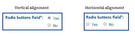
Radio Buttons
Allows the user to give the answer from a list of specific choices, all visible on the screen. We recommend using this type for lists that have 4 choices or less. This type of field is helpful to standardize the possible answers from the user, for example, pour yes/no types.
The choices are based on a source to present to the user. See the Value Lists Wiki for more information on the source.
-
Indicate the name of the field as it must appear to the user.
-
Add the name in the second language if required.
-
-
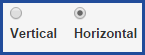
Indicate whether the choices will be presented vertically or horizontally.
-
Choose or create the Source of choices to be presented to the user with the arrow at the end of the field.
-
It is possible to see the elements of the list with the ... button or to create a new one with the + button.
-
- A Default Value can be entered if required.
- One of the elements from the source can be selected.
- Check the Required box if needed.
- A small star will appear in the form to indicate to the user that the field must be filled.
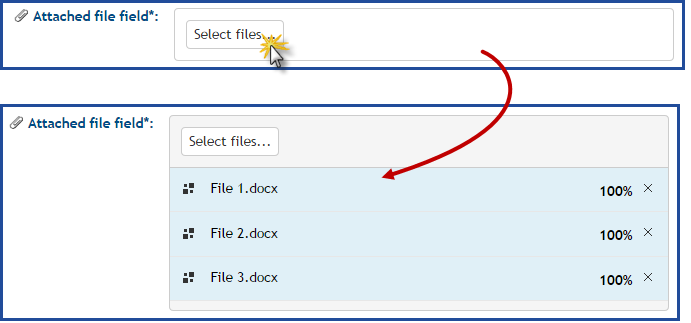
File Attachment
Allows the user to add one or several attachments to the request. It can be used to add screen captures in an incident or a simple form in PDF or .doc format related to a specific type of request.
-
Indicate the name of the field as it must appear to the user.
-
Add the name in the second language if required.
-
- Check the Required box if needed.
- A small star will appear in the form to indicate to the user that the field must be filled.
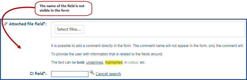
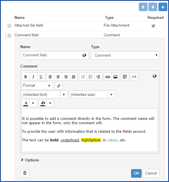
Comment
Displays information in form of text, table, link or image to the user filling the request. The comment can be placed at the desired position of the form to add information or a precision to another form field.
- Add the name of the comment field.
- Note that this name will not be visible in the form.
- Add and format the information that will be presented to the user with the Web editor.
- If required, add the information in the second language.
-
Since this field cannot be filled, it does not have a Required box available.
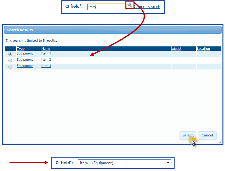
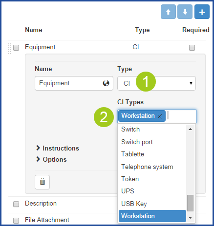
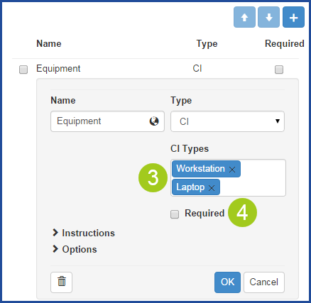
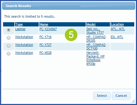
CI
Allows the user to select an equipment or an item from the existing CI database, that will be linked to the request. Although it is possible to make the CI field required when filling the form, we recommend that you let the user fill it or not. Since equipment is often misidentified, forcing the capture in the form may discourage the users from submitting the request from the Web Portal.
It is possible to add more than one CI type field in a form, but if there are more than one CI selected for an incident, only the first one selected will be linked to the request.
-
Indicate the name of the field as it must appear to the user.
-
Add the name in the second language if required.
-
-
If necessary, select the CI types to be presented to the user. The CI search will be limited to the selected types.
-
Multiple types can be selected.
-
To remove a type, click the X at the end.
-
-
Check the Required box if needed.
-
A small star will appear in the form to indicate to the user that the field must be filled.
-
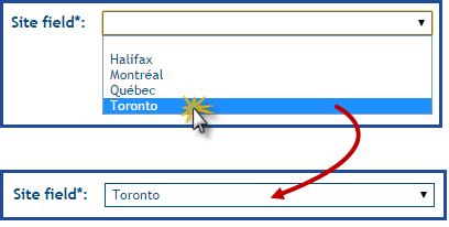
Site
Allows the user to select a site from the list of active sites that exist in the reference data. To see the available sites, go to Tools > Reference data management > General > Sites.
The Site type field will add the selection of the user to the Detailed Description of the request, but will not link it to the Site of the request.
-
Indicate the name of the field as it must appear to the user.
-
Add the name in the second language if required.
-
-
Check the Required box if needed.
-
A small star will appear in the form to indicate to the user that the field must be filled.
-
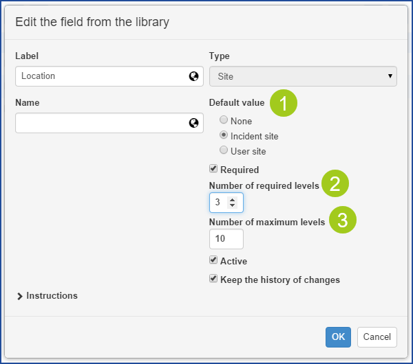
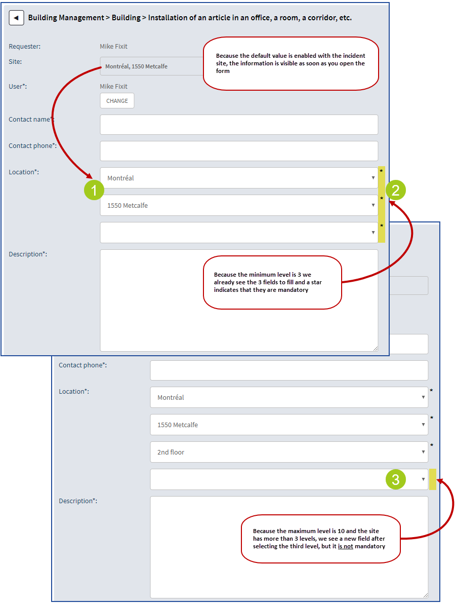
Default Value Plus the Required and Maximum Levels
The following options are optional and should only be used as needed.
- The Default value works in combination with the mandatory site option and is configurable in the Options.
- When used it allows you to have the site previously selected in the request or the one of the user already populated in the form.
- The purpose of using this option is to prevent the requester from entering the information more than once.
-
Number of required levels
-
Allows to ensure that the requester gives a level of information sufficient to proceed with the request.
-
A field for each required level will be visible immediately in the form.
-
A star at the end of the field indicates that it is mandatory.
-
- Number of maximum levels
- This option allows to limit the number of sites or sub-sites regardless of the configured hierarchy in this field.
- In the Web Portal, the field will be limited to the level selected.
- The highest level available is 10.
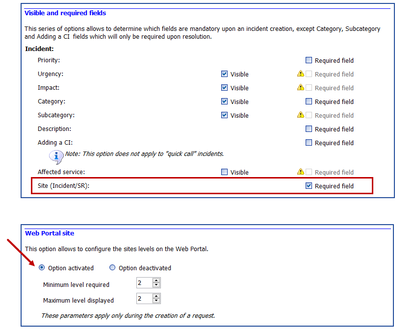
Other Site Options to Know
From the Tools > Options menu:
- Mandatory site
- In the 3 - Important general options > Visible and required fields section.
- This option is configurable by team.
- This option is useful when used with the default value.
- Level of sites visible on the portal
- In the 4 - Facultative general options > Web Portal site section.
-
This option is configurable by team.
-
This option is useful when used with the default value and the required levels.
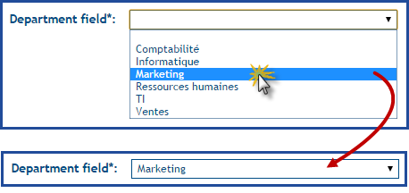
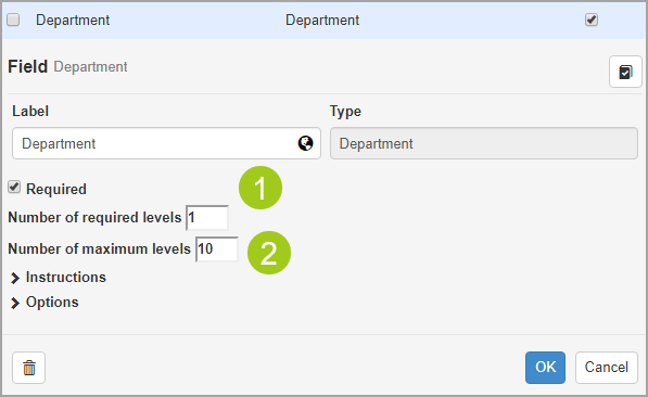
Department
Allows the user to select a department from the list of active sites that exist in the reference data. To see the available sites, go to Tools > Reference data management > General > Department.
The Department type field will add the selection of the user to the Detailed Description of the request, but will not link it to the Department in the statistics. These are based on the user's department.
-
Indicate the name of the field as it must appear to the user.
-
Add the name in the second language if required.
-
-
Check the Required box if needed.
-
A small star will appear in the form to indicate to the user that the field must be filled.
-
Required and Maximum Levels
The following options are optional and should only be used as needed.
- Number of required levels
- Allows to ensure that the requester gives a level of information sufficient to proceed with the request.
- A field for each required level will be visible immediately in the form.
- A star at the end of the field indicates that it is mandatory.
- Number of maximum levels
- This option allows to limit the number of depatment and sub-department regardless of the configured hierarchy in this field.
- In the Web Portal, the field will be limited to the level selected.
- The highest level available is 10.
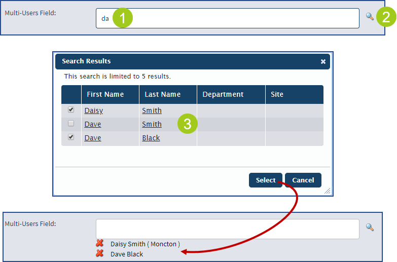
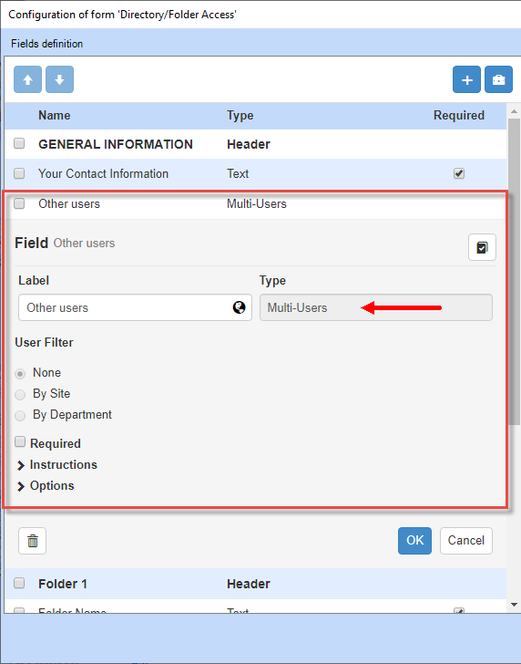
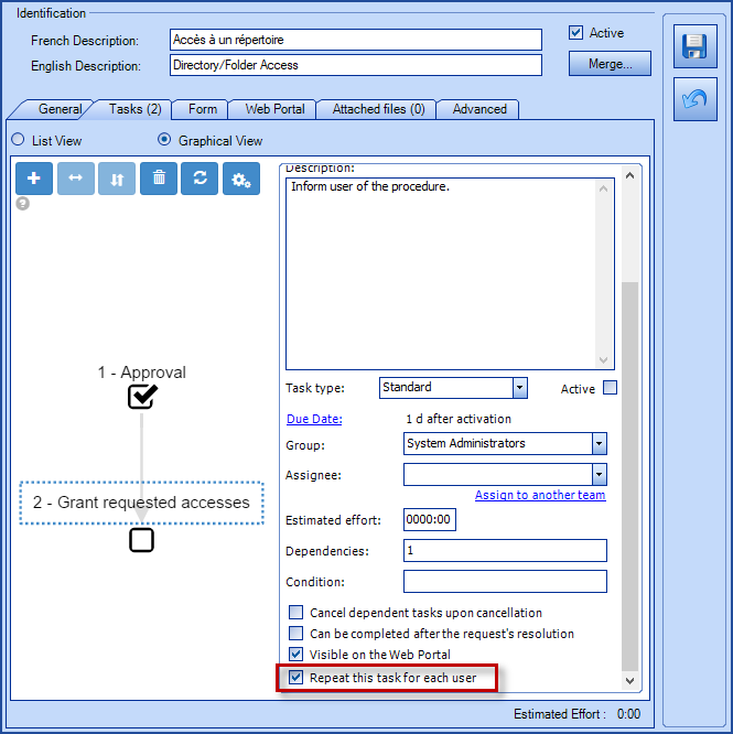
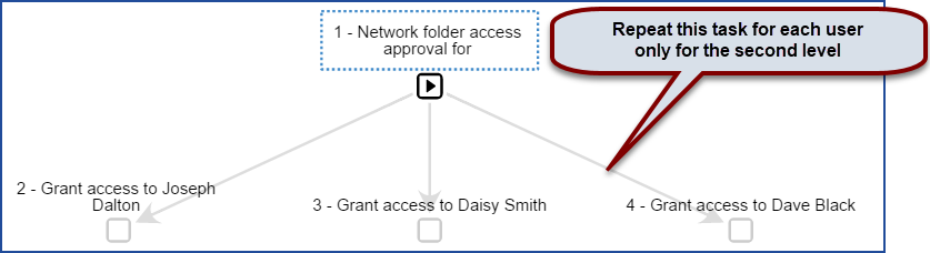
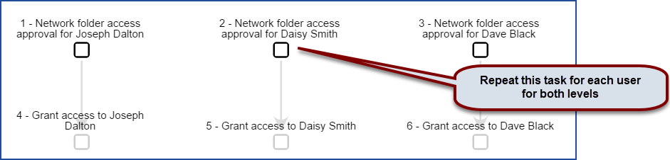
Multi-Users
Allows the requester on the Web Portal to add more than one user to the request. The added users are found in the Users tab of the request and receive the same notifications as the primary user.
The following icon in the request indicates that other users exist:

- Add a Multi-Users field type to an incident template or an SR type.
- If the service request has one or more tasks, the Repeat this task for each user field also allows to have one task per user if required.
- The flow of the request will adjust itself according to the tasks and dependencies.
You can only use one Multi-Users field type per form.
Results of the flow in an SR with 1 approval and 1 execution task
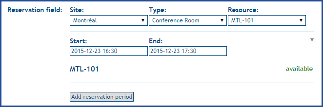
Reservation
Allows the user to reserve a room or equipment according to what has been configured in the CIs.
See the Reservation Management Wiki for the details of the solution.
It is not possible to have CI and Reservation type fields in the same form, because they are both based on CI with different business rules. An error comes up when a form with these two types is saved.

-
Indicate the name of the field as it must appear to the user.
-
Add the name in the second language if required.
-
Add a Default Value
It is possible to preselect a value or information for certain types of fields, this option makes it easier for the user to fill in the information, by already proposing an answer. The method to add this information will depend on the type of field, sometimes it will be in free text other times, you need to select data from a list.
The previous section called Choose the field type explains what types can have a Default Value and how it needs to be configured.
Add Instructions
It is possible to add information directly related to the field in the form of instructions for the user who is entering the information. The instructions will appear under the line of a Header field or on the same line for other field types.
An editor allows to format the text, add links or images, etc. See the Octopus Web Editor Wiki to find out how the editor works. (available soon)
Using the Options
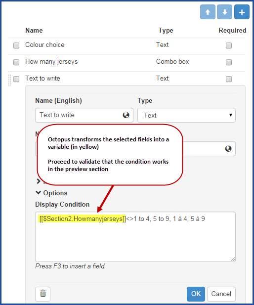
The options are what makes the forms dynamic and powerful, because the Display Conditions can be programmed a question in the form based on the answer from in another question. It's also where you can find the Destination field for the Date and Time field type.
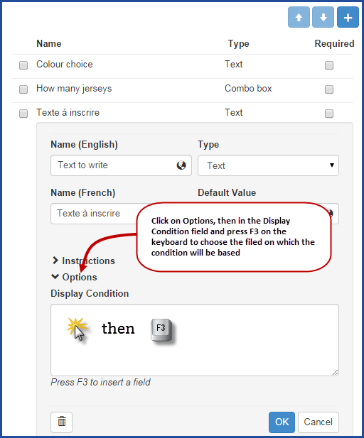
Display Conditions
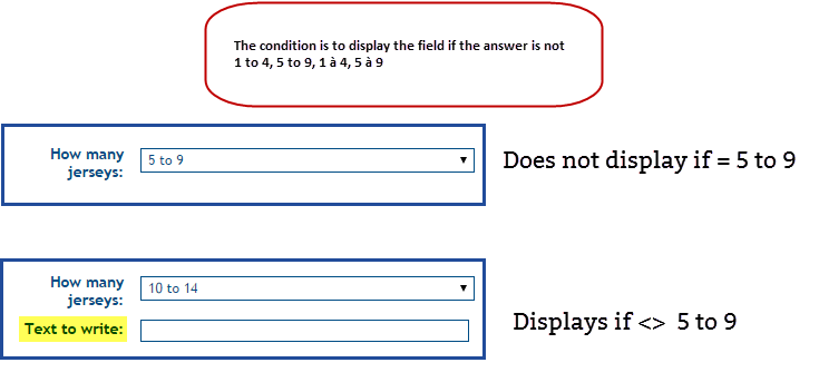
When creating a dynamic form, the fields from the form or the ones from the request represent the criteria that will be used as conditions to determine if the field will appear or not to the user.
Follow these steps to add Display Conditions.
- Go to the Options section.
- Place the mouse in the Display Conditions field.
- Press F3 on the keyboard.
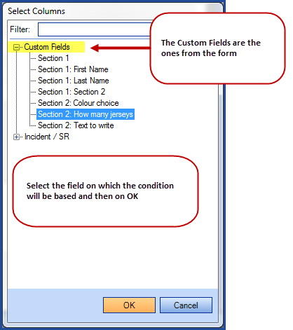
- Select the field on which you want to base your condition.
- Add one or more display conditions.
- Test the conditions in the form to make sure it works.
- Make corrections if required.
- Finish with OK on the field and proceed to the rest of the form's configuration.
Configuring the conditions is part of a separate Wiki, to find out how to program the display conditions, see the Configuration of conditions for forms and tasks Wiki.
Destination
The Destination fields works in combination with the Date and Time and Combo box type fields. It allows to send the date and time selected by the user to the Open Date or the Due Date or the selectected category to the Category and Subcategory of the request.
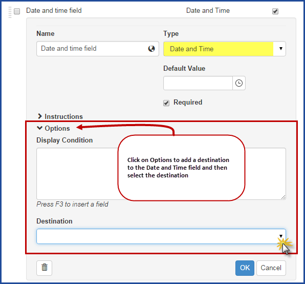
Add a Destination With the Date and Time Type
This option is not mandatory and it can have an effect on the SLA (service level agreement) it must be used with good reason.
- Go to the Options section.
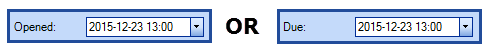
- Choose the Destination; Open Date or Due Date .
- When the user makes the selection, it will not be possible to choose a date in the past if the destination is the Due Date.
- When the user makes the selection, it will not be possible to choose a date in the future if the destination is the Open Date.
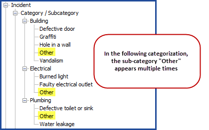
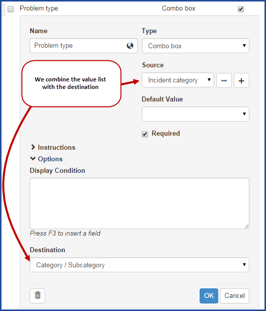
Add a Destination With the Combo Box Type
This option exists only in incident templates.
- Go to the Options section.
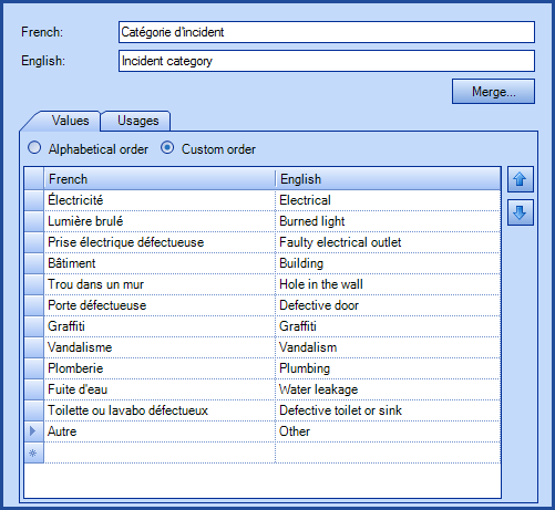
- Create a value list based on the incidents category and subcategory.
- It is not required to have all the categories, just the ones that can be recognized by the users.
- It is possible to add choices that are not part of the categorization, they will be ignored by the destination.
- Add the value list to a Combo box in a form.
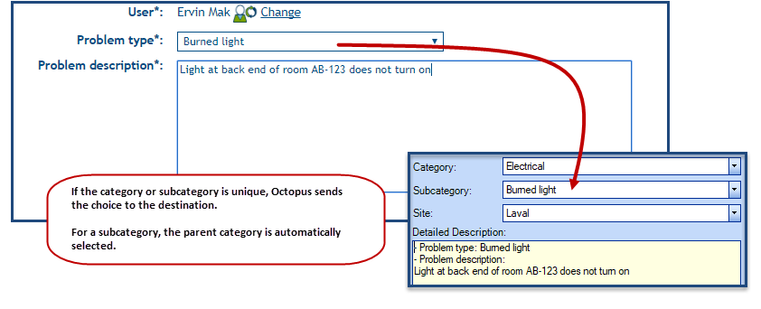
- Choose the Destination; Category / Subcategory.
- If the user selects a choice that is unique in the categorization the category/subcategory will be automatically added to the incident.
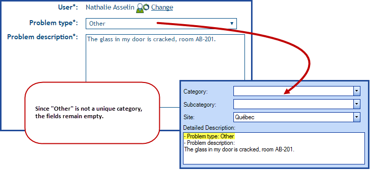
- If the user selects a choice that is not unique or that is not found in the categorization, the category/subcategory will remain empty.
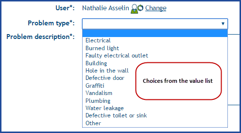
The incident category and subcategory for a team
List based on the categorization
Configuration of the destination of an incident template and results in the Web Portal
Results of an incident with a unique category choice
- Based on a category.
- Based on a subcategory.
- If the subcategory is found, Octopus will automatically enter the parent category.
Results in an incident where the category is not unique or not found in the categories
- The category is not unique or the choice is not found in the category list.
- The fields remain empty.
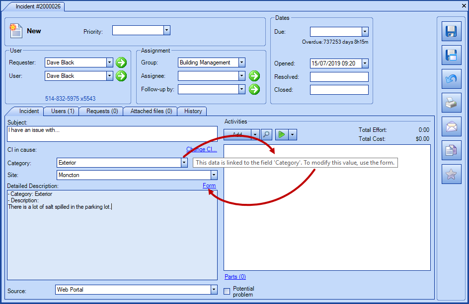
How to Modify the Value of a Destination Field?
When the value of a field is entered using the destination option in a form, the modification of this field cannot be done directly in the request.
You must return to the form to change the value. This is to prevent a mismatch between the information in the form and the one in the request.
How To Delete a Field
If a field is no longer needed, it can be deleted, but note that this action is immediate and you are not prompted to confirm.
- Open the field configuration.
- Use the delete button that looks like a garbage can.

- Use the delete button that looks like a garbage can.
Other Interesting Options
Many other options can be used to help with the request management depending on the environments and the business needs. They are found in the different request tabs.
In the Form Tab
Use the following options to improve the data entry or the results of the form:
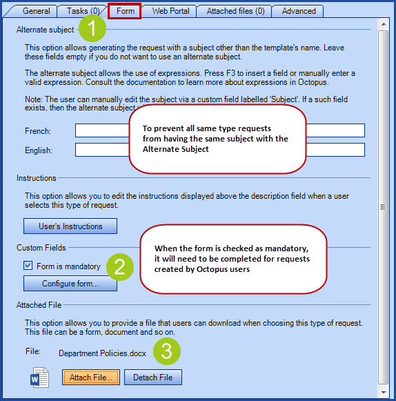
- Alternate subject.
- Allows to program the subject with variables from the request or the form. This can immediately give the right context to the subject. To find out more, see the Alternate Subject Wiki.
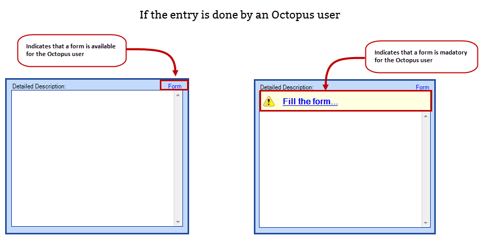
- Form is mandatory.
- Make it mandatory to fill the form for Octopus users. This ensures that same type requests will have the proper information and help ramp up new Octopus users.
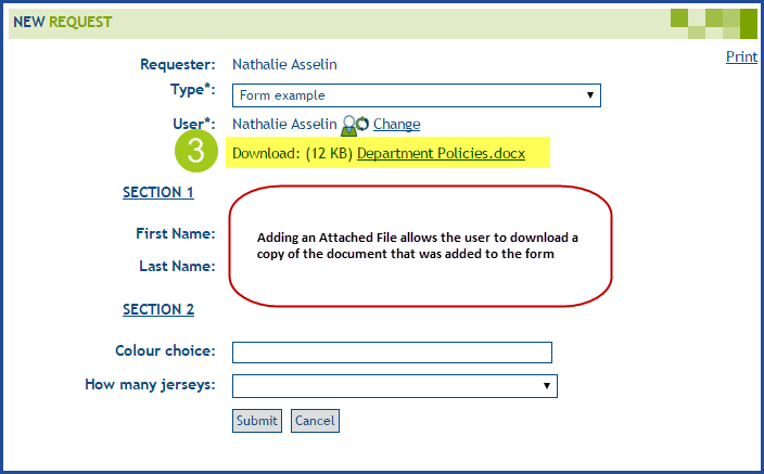
- Attached File.
- Allows to present the user with a file that can be downloaded when choose this type of request. The file can be a form, an instruction document or other.
In the Web Portal Tab
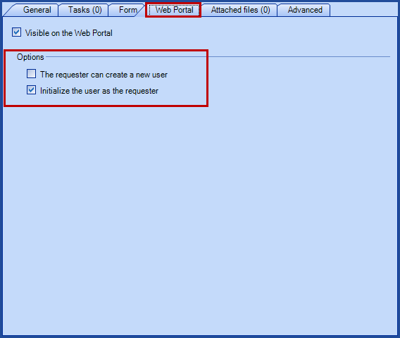
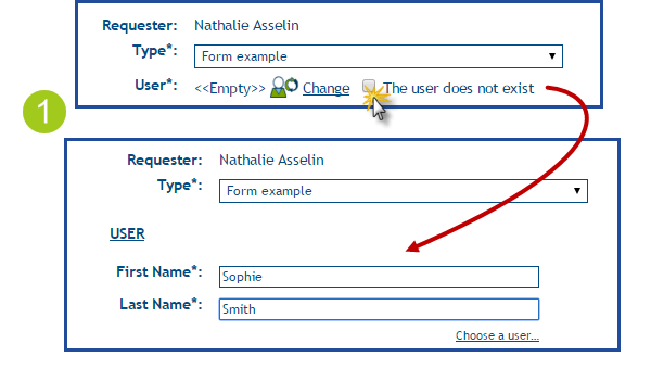
- The requester can create a new user.
- Adds a field called The user does not exist on the Web Portal that allows the person filling the form to create a new user. This is very useful for the New Employee form, for example. Using this option will ensure that a link is created between the new employee and the request.
- It is possible to merge two users, if one that already exist gets created again by someone else.
- Adds a field called The user does not exist on the Web Portal that allows the person filling the form to create a new user. This is very useful for the New Employee form, for example. Using this option will ensure that a link is created between the new employee and the request.
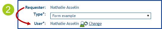
- Initialize the user as the requester.
- Default option, that automatically sends the name in the Requester field to the User field in a new request.
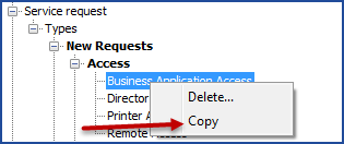
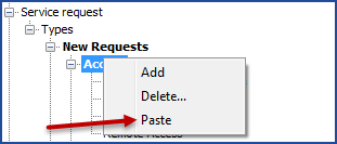
Copy a Form
It is possible to copy/paste Incident templates and SR types into the same DB or to another one. All of the elements from the incident template or SR type will be copied (priority, assigned group, tasks, Web forms, etc.). Copying works from one environment to another, for example from a test DB to a production DB. If both DB do not have the same configurations, the fields that do not match will be empty, for example, a group assignment.
To proceed, you only need to go to the source DB, right-click and copy, then paste in destination DB.
It is also possible to import the Custom forms, this option will remain available for massive form import. For more details on the import of the Custom Forms, see the article: DataImporter - Import Custom Web Forms
Advanced Task Configuration
The advanced task configuration helps to control the request workflow as it allows to create SR types with tasks that will be generated based on conditions linked to the request or the information entered in the form.
Consult the Advanced Task Configuration Wiki for more information.
Thank you, your message has been sent.